


Build a Product Usage Dashboard with Bag of words (Open Source)
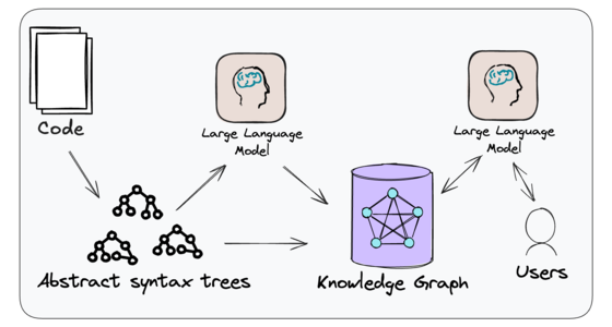
In this guide, we’ll build a product usage dashboard using Bag of words, an open-source AI-powered data tool. It connects to your databases, APIs, and even unstructured data like PDFs, allowing you to create dashboards through simple prompts — no manual SQL needed. Setup Bag of words is designed to let you generate reports, charts, and dashboards using natural language prompts. Best of all, it’s open-source and quick to set up using Docker. *Deploy with Docker * By default, Bag of words uses SQLite, but you can configure PostgreSQL if needed. Run the following command to get started: docker run --pull always -d -p 3000:3000 bagofwords/bagofwords Connect Your Data & Configure LLM Add an LLM provider at http://localhost:3000/settings/models to enable report generation. Connect your data sources at http://localhost:3000/integrations and follow the instructions for your specific data sources. Build your dashboard Understand Data Schema Before diving into data visualization, it’s crucial to understand your data schema — the structure of your data, how tables are connected, and what fields are available. Besides viewing tables via UI, you can also explore the data schema via prompting: • “Show me the list of all tables and their relationships.” • “What columns are available in the users table?” • “How is the transactions table linked to the users table?” • “List all fields related to user activity and session data.” This will give you a clear view of your dataset, helping you craft more precise queries and visualizations. Generate Key Metrics with Prompts Once you’re familiar with your schema, you can start generating key metrics: “Show me daily active users over the past month in a line chart.” “Create a dashboard with total signups, feature usage, and churn rate.” “List the top 10 most used features by active users in a bar chart.” “Display the retention rate for users over the last six months.” You can also run this in a single prompt. Publish and Share Now that your data is ready, you can set the layout in the dashboard by dragging the different elements. You can also ask the AI to do it for you. Once everything’s ready, you can click to the top right Share button and configure the settings and get the sharable URL. More links: https://bagofwords.com https://docs.bagofwords.com https://github.com/bagofwords1/bagofwords

In this guide, we’ll build a product usage dashboard using Bag of words, an open-source AI-powered data tool. It connects to your databases, APIs, and even unstructured data like PDFs, allowing you to create dashboards through simple prompts — no manual SQL needed.
Setup
Bag of words is designed to let you generate reports, charts, and dashboards using natural language prompts. Best of all, it’s open-source and quick to set up using Docker.
*Deploy with Docker *
By default, Bag of words uses SQLite, but you can configure PostgreSQL if needed.
Run the following command to get started:
docker run --pull always -d -p 3000:3000 bagofwords/bagofwords
Connect Your Data & Configure LLM
Add an LLM provider at http://localhost:3000/settings/models to enable report generation.
Connect your data sources at http://localhost:3000/integrations and follow the instructions for your specific data sources.
Build your dashboard
Understand Data Schema
Before diving into data visualization, it’s crucial to understand your data schema — the structure of your data, how tables are connected, and what fields are available. Besides viewing tables via UI, you can also explore the data schema via prompting:
• “Show me the list of all tables and their relationships.”
• “What columns are available in the users table?”
• “How is the transactions table linked to the users table?”
• “List all fields related to user activity and session data.”
This will give you a clear view of your dataset, helping you craft more precise queries and visualizations.
Generate Key Metrics with Prompts
Once you’re familiar with your schema, you can start generating key metrics:
“Show me daily active users over the past month in a line chart.”
“Create a dashboard with total signups, feature usage, and churn rate.”
“List the top 10 most used features by active users in a bar chart.”
“Display the retention rate for users over the last six months.”
You can also run this in a single prompt.

Publish and Share
Now that your data is ready, you can set the layout in the dashboard by dragging the different elements. You can also ask the AI to do it for you.
Once everything’s ready, you can click to the top right Share button and configure the settings and get the sharable URL.
More links: