


_Agata_Gładykowska_Alamy.jpg?#)


Craving Some Color? These 5 Hues Are *It* for 2025
Color is kind of my “thing.” If you’re a reader who recognizes bylines, you may already know that by now. Hi, my name is Arlyn, and having someone ask me what my favorite color is is like asking if I’d ... The post Craving Some Color? These 5 Hues Are *It* for 2025 appeared first on Emily Henderson.

Color is kind of my “thing.” If you’re a reader who recognizes bylines, you may already know that by now. Hi, my name is Arlyn, and having someone ask me what my favorite color is is like asking if I’d rather live without cheese or chocolate. It’s just not a possible scenario. And today, I get the privilege of downloading my thoughts about all the colors in the limelight right now and for the foreseeable future. Welcome to our 2025 Color Trends post.
Last week, the team shared their thoughts on the 2025 Pinterest Palette, which is built from increases in searches and interactions on the photo-driven inspiration platform. Some of those colors are in here (spoiler alert: butter yellow is the color right now), while others are not (Aura Indigo—a lilac for anyone who would rightfully think it’s a deep blue—is not). While I do think purples are trending and have been for a bit, I didn’t think it was big enough to showcase here.
Earlier this year, I dove into three colors I thought were entering the mainstream, and some of them are still going strong with no signs of stopping. There was this post on orange. This one covering primary colors. And this one about brown. Spoiler number 2: I was right about brown (and red, but…duh).
So, let’s dive deep into the top five prevailing colors likely to make their way into your homes in one form or another.
Chocolate & Truffle Browns
Of the five shades we will discuss today, brown (and the color that follows) is undeniable. Everyone knows it. I’d be remiss to be a contrarian and not include it. I’d be lying if I didn’t say I was a bit taken by surprise with this one those months back when it started to become obvious. Brown?? You mean, that color I poo-pooed (pun intended) since we all gratefully moved out of the Tuscan-everything era into the not-really-any-better gray era? Brown is so…brown. Heavy, sparkless, and not that exciting. BUT WAIT, brown has had a strange glow-up, where suddenly it was the key color in a quiet luxury palette. Creams, warm whites, taupes, rich brown. It unexpectedly felt luxurious, sensual, and powerful. It must have gotten the same PR agent as cottage cheese, cauliflower, and kale did. Brown is back, baby, so much so that the Pantone Color of the Year for 2025 is Mocha Mousse, an elegant tan brown with pink undertones. Darker, more pigmented chocolate browns with red undertones were also BIG. I mean…who would have thunk it?
This living room by Ome Dezin shows how much a design-forward brown sofa can really ground a grand ceiling height. I think brown seating can be tricky to get right to not look instantly dated and like something you’d normally stash away in a basement, but a velvet material is a near fail-safe to get it right. It makes the brown come to life by reflecting light in varying intensities, as velvet does.
Designed by Christiane Lemieux, this is an example of that beautiful velvet giving the brown so much depth, lightness, and texture on a large piece like a sofa.
I have been seeing SO much brown tile in bathrooms lately, like in this space by Lala Reimagined. Similar to a sofa, I think the key is to find something with a complex texture, like these hand-glazed Zellige tiles. I love to see this mixed with rich non-lacquered, polished brass and some putty-like gray color on the walls and floors.
See!? The bathroom tile is where it’s at, clearly. Hudson + Bloum Design went with more of a flat, glossy tile, which comes off more modern but still grounded.
Chocolate has many degrees of depth, and this pantry by Bungalowe falls more into the category of milk chocolate. Maybe even lighter. This is what I’d call more of a truffle brown, and think the subtle red undertone is complementary to a lot of different colors. It works great with reds, greens and purples, but also plays fair with high-contrast black and white.
Case in point, by Blanc Marine Intérieurs. This is certainly a bit darker than that previous pantry but still in the same truffle family. It’s so beautiful with dark charcoal grays and a variety of lighter wood tones.
For anyone who can’t do brown in large doses, it really can be such a lovely touch in a compact package, like the lamp here in a shot from Lulu & Georgia.
All The Reds
Like brown, red is an undeniable force in color trends this year. It all started with the explosion of the Unexpected Red Theory, and while the chatter of that specific phenomenon has died down, using red (any shade, really) is very much alive. I mention any shade because it’s not just primary red that I’m seeing. It’s deep burgundies, cool cherries, warm bricks, and lots of pinks, which frankly could have been its own category in this post, but five felt like a more auspicious number than six so I dropped it from the lineup. I’m talking fuchsias, mulberries, raspberries, etc. Let’s take a look.
Popping in a hue of red into a mostly neutral space is such a power move, and always works to bring in intrigue and tension without feeling overly colorful, like Neptune Home did here. If you’re opting to paint something like millwork, doors or a furniture piece, going with a matte finish will keep the red more subdued.
It’s funny how comfortable people are with painting the exterior of their front door red, but then choosing white for the interior. We’re only seeing the exterior here in a home by Bespoke Only but based on the trimwork inside being red, I’m going to take a not-so-wild guess that it’s also red inside. And it’s so special!
Need a color for a vintage casegood find that could use some new life? Claire Champion went with this bright red and doesn’t regret it for a second. It’ll completely transform whatever room it’s placed in.
Don’t forget that red can be a design cameo, not having to take over a whole wall, cabinet or furniture piece. Sometimes, just some hardware, for instance (thanks for the idea Zoe Feldman Design), is all it takes to zip some energy into a room.
Ryan Lawson pairs a garnet velvet bed with rich brown bedding, which is a color combination I wouldn’t traditionally go for but works as a way of bringing life to the brown, but toning down the red.
Not into brown and red? Maybe try pink and red, like Summer Thornton Design. The red here is more of a brown-tinged cinnamon, so it feels less like intense color blocking against the rosey wallpaper and more like two sisters mingling.
A daring ruby velvet TOGO sofa in the home of Coleman Domingo makes the wood paneling on the wall feel both retro but fresh when paired with the electric blue artwork above it. A play on primaries with just a shift in hue can be a bit less playful (in a good way).
While I love a jazzy punch of primary red, I think I love a slathering of deep burgundy more. Especially on cabinetry like Sarah Sherman Samuel did above. This is almost plum or purple in the right light, and I’m not mad at it one bit.
Lisa Staton Interior Design kept the burgundy kitchen from feeling over the top by keeping the bosom of the space a creamy tone. That shade of red practically begs to be paired with warm neutrals and a dose of black and gold.
Sky Blue
Okay, we’ve entered the less obvious area of this year’s trending colors. While blue is essentially neutral at this point, never going out of style in any capacity, it’s been used so thoroughly in a chalky, grayish shade for the better part of a decade. While that Swedish or French variation is gorgeous, I’m putting my money on a brighter, clearer sky blue.
 ABBIE
ABBIE
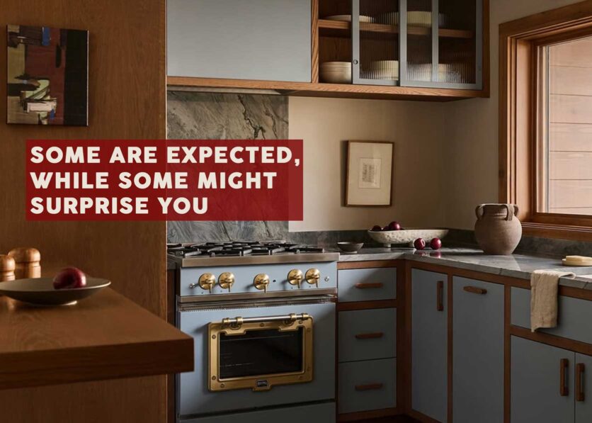
Something like the color a NABER DESIGN used in this kitchen reno is just so happy without feeling juvenile. It doesn’t have the cloudiness of muddy blues but still feels easy on the eyes. Marrying it with serious wood tones (think oak and walnut) keeps it squarely adult.
Here’s another example of sky blue with grounding wood tons, by Yond Interiors.
I have always loved the combo of sky blue and bright or brick red, so I love to see this sweet room from Sarah Peake. It’s a kids’ room, sure, but feel free to add my name to the sign-up list if one were to ever pop up.  Read More